Amnesia: The Dark Descent
*Note that all images save my mockup are taken from the game Amnesia: The Dark Descent. I assume no ownership over original images.

Much of the interface in Amnesia: The Dark Descent, is very
organic. There is a small aiming reticule in the center of the screen, but it’s
only just visible to give the player a guideline for where their cursor is
currently pointing. The cursor changes images depending on whether the player
is hi-lighting an object that can be picked up or interacted with.


The two attributes the player needs to keep track of in the
game are the player’s Sanity and Health. Health is self-explanatory; if it
depletes all of the way, the player will die. Sanity is a measure of how stable
the player is. Depletions in Sanity make navigation more difficult as the
screen will blur and shift more. It can also make avoiding monsters more
difficult as the player is more likely to give himself away if his sanity
deteriorates to dangerous levels. Depletions in health are indicated by impact
markings on the screen whereas depletions in sanity are indicated by an effect
that makes it look as though the screen is swaying from side to side while the
sound of teeth grinding together plays in the background.


The problem with Amnesia’s interface, in my opinion, lies in how the inventory operates. The inventory is standard fair for anyone who’s ever played a video game, but that’s the problem; Amnesia is meant to be more of an experience and less of a game. With a game where most of the feedback is so organic and integrated into the game, without needing to take a break, a paused menu takes away from the experience. To be fair, the interface fits will with the visual aesthetic of the game. The fonts used and flourishes in the design are indicative of the medieval and Lovecraft-ian atmosphere of the castle the player has to navigate. The design almost appears bone-like. Likewise, the design of the icons in the inventory displaying what the player is carrying follow the game’s overall visual aesthetic. It’s this paused-screen layout that I take issue with.

(From game, not a mockup by me)

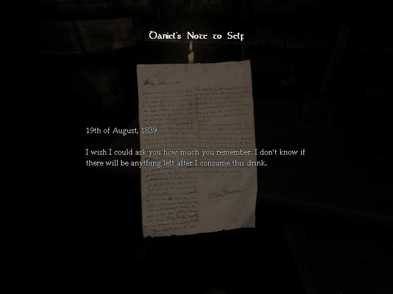
Notes and journals would be accessible through clicking on
the journal within the bag, which would be visible at all times. Doing this
would pause the game and cause the standard journal menu to appear. Though this
does drop away some emersion, I feel it’s an allowable break. The journal
entries are often accompanied by a voiceover and background noise could make
listening to this voiceover difficult if everything took place directly in real
time. Bioshock did use a similar method, playing found info tapes in real time,
but a key problem I found with this is that dialog would be lost by enemies
attacking and background noise unless the player just stood still in one place.
Health and sanity displays are a bit trickier. I would say
that damage and decreased sanity could be indicated by the player’s hands as
they look at the bag. Mousing-over the hands could display the same kind of
tool-tip that displays when the player mouses over the brain and heart icons in
the old menu setup for a clearer indication of how hurt the player is.
All other parts of the interface I would leave alone. I had
briefly thought of suggesting the inclusion of an animation of the player
picking up found notes, but again there is the problem of the voiceover that
plays when most notes are found.
(Once more, from game, not me)
nice
ReplyDelete